The Two-Texture Rule That Makes a Plain Outfit Look Considered
Quick Answer: A simple outfit in one colour family reads as unfinished when every piece has the same surface. Introduce a second, clearly different texture - smooth against rib, matte against sheen, fine knit against structured weave - and the same outfit reads as deliberate. The rule: at least two distinct textures, no more than three, with the contrast obvious enough to see from across a room. This works because texture creates visual interest without adding colour or pattern, which is exactly what a minimal outfit needs.
You own a black top and black trousers. Some days that combination looks sleek and some days it looks like you gave up. The colour did not change. The surfaces did.
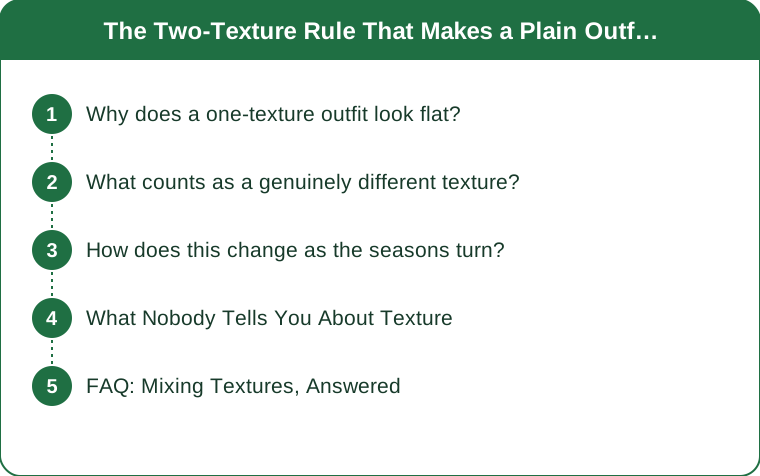
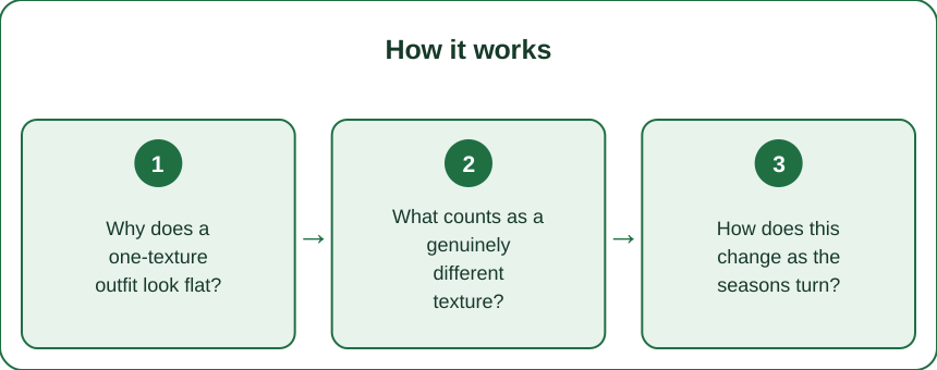
Why does a one-texture outfit look flat?
Because the eye reads surface before it reads shape, and a uniform surface gives it nothing to hold onto.
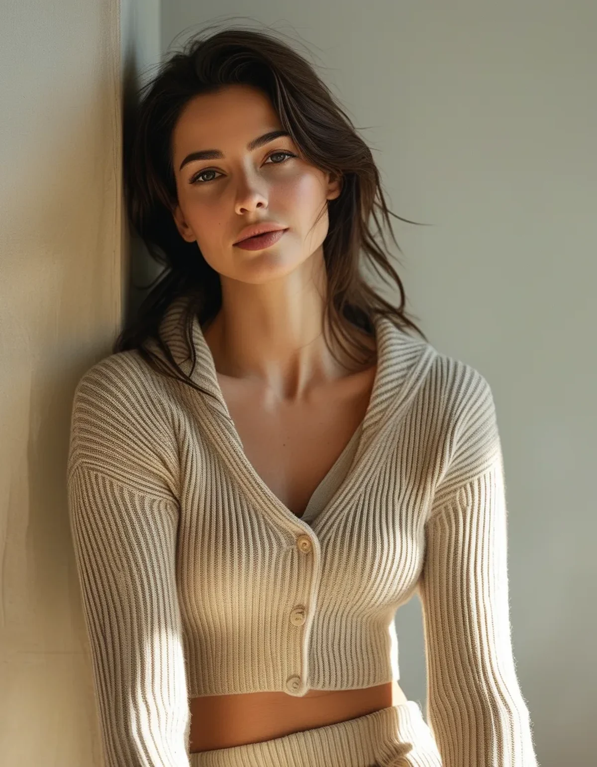
Texture works by how it handles light. A smooth surface reflects evenly. A ribbed one creates alternating highlight and shadow. A matte weave absorbs. When every piece behaves the same way with light, the outfit becomes a single undifferentiated block, and the eye reads block as flat - regardless of how good the individual pieces are.
This is why a head-to-toe outfit in one colour can look either extremely sophisticated or extremely cheap, and the deciding factor is almost never the price of the garments. A cashmere knit with a wool trouser reads as luxurious because the two surfaces are audibly different. The same colour in two identical jerseys reads as a tracksuit.
The practical version: when an outfit feels boring but you cannot say why, the answer is usually that everything has the same finish.
What counts as a genuinely different texture?
The contrast has to be visible from a few metres. Two slightly different knits will not do it.
Reliable pairings:
- Rib against smooth - a ribbed knit with a flat-front trouser or a satin skirt
- Matte against sheen - wool or cotton with silk, satin, or a subtle leather
- Fine against chunky - a slim base layer with a substantial cardigan or coat
- Soft against structured - jersey with denim, or a knit with a tailored wool
- Flat against textured weave - a plain top with a tweed, bouclé, or corduroy
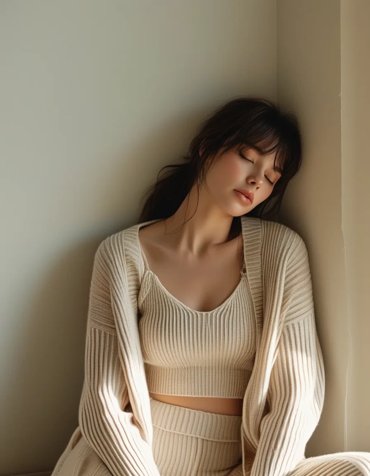
The single most useful pairing to own is a fine ribbed knit and a smooth, slightly heavy trouser. It works in every colour, across seasons, and the contrast does all the styling work without any accessorizing.
How many is too many?
Two is the working minimum. Three is the ceiling for most outfits, and the third should be small - a bag, a shoe, a belt. Four distinct textures start competing with each other and produce the busy look that texture was supposed to avoid.
An easy way to count: base layer, main garment, outer layer or accessory. One texture each.
How does this change as the seasons turn?
Texture is the main tool you have for making an outfit feel seasonally right without changing colour at all.
As the weather cools, the textures that read as current shift toward substance and depth: rib, cable, bouclé, corduroy, suede, brushed wool, heavier denim. The same navy outfit in linen and cotton reads as summer; in rib and wool it reads as now.
Transitional pairings that work this month:
- Fine rib knit with a smooth cotton trouser - warm enough for a cool morning, light enough for a warm afternoon
- A slightly slubby linen-blend shirt over a smooth base, which bridges both seasons
- Suede or nubuck shoes with anything smooth - the single fastest way to make a summer outfit read as autumn
What to retire first: high-shine synthetics and very flat, papery cottons. They read as warm weather more than any colour does, which is why a white cotton shirt can look out of place in October while a cream ribbed knit in the same shade does not.
The useful mental shortcut: as the light gets lower and warmer, surfaces that absorb and diffuse light look right, and surfaces that reflect sharply look leftover.
What Nobody Tells You About Texture
Texture is the cheapest way to look expensive. A well-chosen contrast between two mid-priced pieces beats one expensive piece in an otherwise flat outfit, because the eye is reading the relationship rather than pricing the garment.
It photographs better than colour does. In a photo, subtle colour differences flatten out. Texture survives, because it is created by light and shadow, which is exactly what a camera records. This is why the outfits that photograph as considered are almost always texturally varied ones.
Black is the hardest colour for this and the most rewarding. Black absorbs light, so texture is the only source of variation available. An all-black outfit with genuine texture contrast is one of the most polished things you can wear; an all-black outfit without it is the flattest.
Pilling destroys texture before it destroys the garment. A ribbed knit that has pilled has lost the crisp shadow lines that made it work. It still fits and it no longer contributes. This is one reason things stop looking right long before they wear out.
Texture can substitute for accessories. If you dislike jewellery or find scarves fussy, a strong texture contrast provides the same visual interest with nothing added. This is a genuinely useful route for people who prefer a plain look but keep feeling under-dressed in it.
FAQ: Mixing Textures, Answered
Can I mix textures in the same colour?
That is where the rule is most valuable. Tonal dressing - one colour, several pieces - only works when the surfaces differ. Same colour, same texture is the flattest possible combination; same colour, contrasting texture is the most sophisticated.
Does a print count as texture?
No, they are separate variables and they compete. A print already provides visual interest, so heavy texture contrast on top of it usually reads as busy. With a print, keep the textures simple and let the pattern do the work.
What if everything I own is jersey?
Start with one addition rather than a wardrobe overhaul: a ribbed knit, a pair of denim or wool trousers, or suede shoes. Any one of them creates contrast against everything jersey you already own, which is a large return for a single purchase.
Is there a texture that goes with everything?
A fine rib is the closest thing. It contrasts against smooth, against structured, and against chunky, and it works in every colour and most seasons. If you are building deliberately, that is the piece to buy first.
How do I check if my outfit has enough contrast?
Photograph it and look at the image in black and white. Colour disappears and only texture and shape remain. If the greyscale version looks flat, the outfit needs a second texture - it is the fastest test there is.
TL;DR:
- Flat outfits are usually a texture problem, not a colour problem - every surface handling light the same way.
- Use two clearly different textures, three at most, with the third kept small.
- The most reliable pairing to own: a fine rib knit with a smooth, slightly heavy trouser.
- Black needs texture most, since it absorbs light and offers no other variation.
- Check it by photographing the outfit and viewing it in greyscale. Flat in black and white means flat in person.
Minimal dressing does not fail because it is too plain. It fails when nothing in it catches light differently from anything else - and that is a five-second fix on the way out the door.
Keep Reading
This article is for general informational purposes only and is not medical advice. It is not a substitute for professional diagnosis or treatment. Always consult a qualified healthcare provider about your individual situation, especially before making significant changes to your diet or exercise routine.